Thursday, 23 February 2012

Colour cast and white balance (Part 2)

For the second part of this exercise we moved indoors to look at mixed light - outdoor and indoor light.  I decided to shoot from the inside of my house for these images.

Auto
The light inside and outside looks pretty accurate and the way we would expect it to be. 

Sunlight
This is too warm for the indoors light whilst being accurate for the light outside

Tungsten
Makes inside look correct but the outside light at the window is a bit blue.  This would be even bluer if it was a little darker outside. 

Our eyes acclimatise to the differences in the light we have both indoors and outdoors.  It is only since doing this exercise for the Art of Photography some months ago I realised how much they do.  Tungsten bulbs do emit a warmer more yellowish light which our eyes come to accept as normal once we have adjusted to the lighting situation.  

I think that out of the three I would tempted to go for the Tungsten image as the indoor whites seem white and the outside light just looks like night is starting to fall.  

The most unacceptable has to be the sunlight setting.  It is far too warm for the tungsten light.  

Another alternative would be to take the Auto light and make some adjustments.  

Exercise: Colour cast and white balance (Part 1)

For this exercise I had to find the following setting and shoot using the different white balance settings on my camera in a variety of different outdoor lighting situations.

I had to wait a few days to do some of this exercise as the weather didn't provide me with any sunny days.  However, I did manage to get some sunshine in one day and shot this local scene near to where I live.  I also used this scene as the subject for the cloudy situation.  I found it interesting to compare not only the white balance but also the effect the outdoor lighting situation had on the same subject.

Sunlight
Auto
Pretty accurate when compared to the sunlight setting for white balance.  

Sunlight
This is very similar to AWB.  The colours may be slightly washed out. 

Cloudy
This adds a little warmth to the image.  Not too much as in the Shade setting below but just a little.  

Shade 
Very warm.  Too warm for my taste.  I have lot the richness of the colours in the sky and the house and foliage too. 

I think that Auto and Sunlight are the best settings for a sunny setting.  

Cloudy
On a cloudy day the subject looks very different.

Auto
Pretty much how it looked in reality.  

Sunlight
Looks a little like Auto but it more cold.  

Cloudy 
Adds a bit of warm to the image 

Shade
This looks a little like an old fashioned image it is a bit too warm again. 

I feel Auto was the best setting here.  Cloudy might be good if you had warmed colours in the shot.  I suppose something like shooting at sunset/sunrise would be a good example of where cloudy would give added warmth.  

Shade
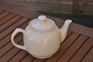
I used a teapot on the garden table for this series.  

Auto
Pretty cold

Sunshine
Cold with a loss of depth in the colour

Cloudy

Shade
Warm

There is almost a bluish tinge to the Auto and Sunlight settings. We lose a little of the warm of the ceramic teapot.  However I am not totally convinced that Shade is the best setting for this composition and lighting situation.  I feel the need to experiment more to see more results before I make up my mind entirely.  

This exercise proves that the Auto setting on my camera is pretty good at guessing an accurate white balance for the various lighting situations I shot in.  Perhaps instead of changing from one setting to another I could just tweak the Auto setting to give a warmer result for images taken in the shade and cloud.  This is something I intend to play around with during my next shoots. 

White balance and overall colour

White balance is a very important setting on our cameras.  It is often overlooked because we are unaware of the neutral, colourless ambient light present in our images.

This is because our eyes adapt quickly to the changes in the colour of light.  For example, there is a difference in the colour of sunlight when the sun is high in the sky to when it is setting.  Tungsten and flourescent lighting have a orange/red and green hue respectively.  Our eyes do not notice this colour because our brains process and 'neutralise' these colours.

The camera's sensor will record all these colours.  This means that we need to consider changing the white balance in different lighting situations.

Our visual standard for colour is sunlight and in the middle of the day it is 'colourless' which we refer to as white.  This is our benchmark for normal lighting.  From this white in the middle of the day sunlight takes on a reddish hue at sunset and sunrise.  This is often seen as yellow or orange in a weak sunset/sunrise.  A very strong one however would make for a very red sky.  In the shade on a sunny day the light takes on a bluish colour.  We refer to these colours as the colour temperature scale and this is measured in degrees Kelvin.

Color Temperatures in kelvin units

In general, the cooler the Kelvin temperature the warmer the colour.  Therefore we need to be careful when describing reddish colours as warm because in fact they are cooler on the Kelvin scale.

Let's think about why colours have a 'temperature' briefly.  If we were to heat something that wouldn't easily burn like iron, it first becomes reddish, then yellowish and then white.  In hotter temperatures materials can become blue.

As we can see from the above scale, midday sun has a temperature of about 5400 to 5500 Kelvin.  When the sun lowers in the sky the temperature drops to about 4000K in the afternoon to below 3000k at sunset.

Reflected light from a blue sky can be as high as 6500K.  This is shaded areas.

D90 white balance settings

  • Auto - this generally makes a good guess at the white balance.  I have found it to be pretty reliable in most situations and tend to shoot mostly using this setting. 
  • Incandescent - tungsten.  Makes images very blue - use indoors with conventional tungsten lighting.  You can also use it to make your images have an arctic feel to them say in landscapes etc.  
  • Fluorescent - makes images taken with fluorescent less green.  I generally prefer to use the Auto setting for these situations because I haven't found this to have a noticeable positive effect on my images. 
  • Direct sunlight - midday sun.  
  • Flash
  • Cloudy - produces warmer than direct sunlight.  I tend to use this for sunsets when I want warmer colours.
  • Shade - adds a bit of orange to your image to tone down the blue associated with shooting in the shade.  
  • K to choose a colour temperature.  5400K for direct sun, 7500K for shade.  
  • Presets - I can save 5 presets on my camera.  You can use a white piece of card or paper to set the white balance using presets. Place the white card in the same light as your subject and then press the WB button.  The camera will automatically record the correct temperature for you to use in that particular setting.
Within each of these I can adjust the white balance to fine tune the settings. 


Exercise: Scene dynamic range

The purpose of this exercise is to measure the brightness in a variety of images so we can get used to working with our own camera's dynamic range.

One of these images should have a very high dynamic range and one should have a low range and appear quite flat.

This image has a high contrast with the reflective surface of the water and the white sky and dark shadow areas.  I shot at an aperture of f/7.1
The white sky reading was 1/1600s.  The deep shadow areas of the boat gave me a reading of 1/50s.  There is about 5 stops in the scenic dynamic range of this image. 

I avoided bright whites in this image to produce a more low range image.  I shot using an aperture of 1/I got a reading of 1/25s for the shadow areas under the bench and 1/250s for the bushes in the background.  There are 3 stops in the scene dynamic range.


In this image I shot using an aperture of f/8.  The bolt area gave me a reading of 1/60s and the yellow sign 1/500s which is about 3 stops.

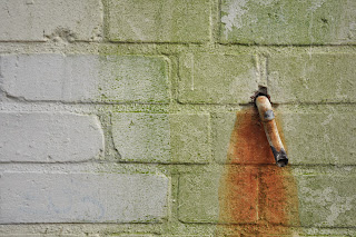
This is a pretty low range composition giving a reading of 1/60s for the pipe area and 1/250 for the off white walls.  This is 2 stops.  

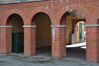
This image provides a bit more contrast.  Shooting at f/11 I got a reading of 1/8s for the deep shadow areas under the arch and 1/320s for where the sun is shining in the right hand side of the image. This equates to 5 stops which would suggest this is a more contrasty image.  

From doing this exercise I have discovered that shots I thought were not so 'flat' are relatively flat.  I seem to conjure up foggy landscapes when I think of low range.  Scenes with colours that do not vary in brightness equally provide a low range as in the image of the pipe above and the building site hoarding.  

I think I also thought that more contrasty images would use the full dynamic range of the camera but the first image in this series proves that this is not the case.  I did under-expose the shot to retain all the detail in the sky.  I wonder if the dynamic range would have been affected if I let the highlights blow.  When I next shoot in this situation I will try this out.  


Wednesday, 15 February 2012

Exercise: Your camera's dynamic range

This exercise sets out to establish your own camera's dynamic range by counting the number of f stops between the brightest and darkest areas in a single image.

Firstly I had to find a scene that had bright sunlight, a reflecting surface and an area of deep shadow with a dark surface.  I used a window for this.

I shot this image at f/8 1/80s to make sure there was no highlight clipping.  It was difficult to get a shot without over-exposing too much with the sun shining directly on the window frame.


The reading I got for the highlights was f/8 1/1250s.  The reading for the darkest areas was f/8 1/10s.  This gives a dynamic range of 7 stops which is less than I would have expected.  

A more accurate assessment of the camera's dynamic range can be carried out using tools like Imatest which performs a range of tests.  From looking on the internet a Nikon D90 has a dynamic range of 8.3.  

When I colour sampled the pixels in Photoshop I got 7 for the shadow areas in the window and 233 for the window frame.  I expect that the lower value for the highlights is down to two things; the fact that I had to overexpose the image by about a stop to ensure the highlights weren't clipped therefore making the whites slightly darker overall and secondly I shot this at ISO100.  

The D90's sensor has a native sensitivity of ISO 200 with ISO equivalent available by using the Lo 1 setting.  It was this Lo 1 setting I used for this exercise.  The dynamic range of Lo 1 has almost one stop less dynamic range in the highlight regions which you could expect to have from an ISO 200 picture overexposed by a stop.

I changed the ISO setting to 200 and shot again.  This time I did not have to adjust the exposure and was able to use the camera's meter reading of f/8 1/200s which is approx one stop in the difference.  I measured the highlights and the shadow area again and got readings of f/8 1/6s and f/8 1/1250s. This gives me a dynamic range of 8 stops.

I think the most accurate way to get your camera's dynamic range would be to use the tests from Imatest.  However, in the field we would not be able to shoot with precision so having an awareness of your camera's dynamic range should be enough to capture well exposed images.

Tuesday, 14 February 2012

Zarina Bhimji at the Whitechapel Gallery


The OCA organised a study visit on 11 February to see the work of Ugandan born British photographer/film maker Zarina Bhimji. 

Having not even heard of her before and not seen how film can be used alongside stills in an exhibition, I was interested in going to see how she used film narratives to explore her heritage and ancestry.

Bhimji was born in Uganda in 1963 to Indian parents and moved to Britain in 1974 a couple of years after Idi Amin expelled the Asians from the country.  Landscapes and buildings haunted by their layered past are the subjects for images. 

The exhibition traces 25 years of her work including the premiere of her latest film Yellow Patch which was inspired by trade and migration across the Indian Ocean.   Haveli palaces and the colonial offices in Mumbai harbour provide the subjects for some close up painterly images together with the desert, the sea and the boats which set the atmospheric scene for several different journeys.

Out of Blue her first film is included in this collection.  The film is a visual journey across the Ugandan countryside with the sounds of fire, birds and humans.  However, in both her films there is a distinct lack of humans only the traces that they were there, that the places she shows us were inhabited but are now empty. It is almost as if the places she introduces us to has its own story to tell us, the abandoned homes, the empty graveyard and the deserted countryside.  It is a narrative of the Asians leaving Uganda, their homes and the breaking up of families.

The collection also includes a series of stills from Out of Blue and Yellow Patch along with other photographs.  Bhimji made the decision to work with film instead of digital as she felt it gave her more depth and achieved the artistic effects she wanted to achieve.  This can be seen very much in her photographs from the series titled Love with the saturated colours and painterly effect. 

Her decision to move away from still images and into film was because she felt that her images and subjects had more to say and needed a different medium that would allow for this. To be honest, I didn’t know what to expect when I sat down to watch Out of Blue. The museum guide had spoken about the disjointed sound and the lack of people in her films.  This is something we are not used to.  I wondered how she achieved a 25 minute film in this way.  The impact was almost instantaneous.  From the beginning the booming sound set the dark and eerie atmosphere that something was not right, it invoked a sense of fear. 

The image titled Frightened Goats from Love stood out to me.  Here we could see a series of graves near a small building which looked like a house.  Some of these looked half dug.  The sense of abandonment in this image is very strong.  There are no people.  This is what remains when people are forced away from their families and the graves of their parents.  This is the void that is left after expulsion.

Illegal Sleep is an image of a row of rifles laid up against a wall taken from Out of Blue.  I liked the colour in this image.  In the film this images comes to life as we see the shadows of people walking past the guns.  This drives a fear through us.  These guns come to life with the introduction of man.  Her work is very much about the echo it creates rather than bare faced facts.

Polaroids from her research were also displayed.  As I am now studying narrative and looking at my workflow I found it very interesting to see work from her lengthy recces and insight into the way she worked.

Her work commissioned by Harewood House examined the hidden histories of black people and the slave trade.  I especially liked the mirrors that contained etched newspaper copy about the details of the servants that ran away.  We are all forced to look at ourselves and those around us as we read. 

Other images in this collection made use of transparency lightboxes which gave a surreal effect. 

 She Loved to Breathe – Pure Silence combined black and white photographs with the colourful spices, turmeric and chilli powder which was arranged on the floor.  This work comments on the controversial immigration protocols in Britain during the 1970s. 

Before I visited this exhibition I would say I had never considered using film for a narrative.  Since the visit I can’t help but think of ways it could work alongside my work and my interests.  Being Irish and having experienced the abandoned countryside in the 80s due to widespread immigration, I can see the beauty in the land which has its haunted layered histories from invasion, independence, civil war, emigration and most recently from boom to bust.  Maybe one day I will dare to explore this further. 

More information:

Clip from Out of Blue


Dynamic Range

Highlight clipping and noise are the two most important technical problems in digital photography.  They are opposite ends of the tonal scale and therefore they define the dynamic range of the camera.

Dynamic range is the range between light and dark your camera's sensor can capture in an exposure.  We as photographers can measure it in terms of stops.  The dynamic range of a scene is the number of stops from the brightest highlight to the darkest shadow in the image.

The highest image quality in digital photography arises from utilising the full dynamic range of the sensor to capture the full range of the scene.

Getting technical
As we already know, our eyes deal with light differently to what our camera's sensor does.  In general our eyes can handle 20-24 stops of light whereas the average DSLR has a dynamic range of about 10-11 stops.  This means that a single frame can capture brightness levels 10 or 11 stops apart without clipping the highlights.

From a more technical point of view the dynamic range for a sensor relies on limits.  Firstly the capacity of each photosite to hold electrons - full well capacity.  The larger the area of the photosite, the better this will be.  Modern DSLRs (high end) have capacities of 7,000 to 10,000 electrons.

Secondly, the limit set by noise and the point at which noise cannot be distinguished from real detail.  This is called the noise floor which has 4-8 electrons. If you divide the full well capacity by the noise floor you will get the dynamic range of the sensor.  

Losing information
If the dynamic range of your scene fits that of your camera, you will have an image that captures all the visible detail.  However, if the camera's range is less than the scene all the visual elements will not be captured and something will be lost in your image. This something usually results in the clipping of the highlights and noise in the shadow areas.

Working with your camera's range
The dynamic range is between the brightest and the darkest that can be captured we need to find the end points to work out what our camera can handle.  Highlights are the easiest to find.  The highlight clipping warning tells us when we are about to lose information from the brightest parts of our image.  We can use this to find the exposure that just captures the brightest highlight.

Noise on the other hand determines the darkest tone for the dynamic range.  This is because noise results in the shadow areas where not enough light has hit the sensor.  This causes a sampling error  resulting in speckles in your image.

Looking at the dark areas of an image there is a point where it becomes impossible to distinguish between noise and real detail, any darker and the noise drowns out all the detail.  To see this we can lighten the image  in Photoshop.  However, there is also an element of taste here and what one person would determine as noise and drowned out detail another would find acceptable in the image.


Exposure and the sensor

Without getting into too much technical detail, I think a general understanding of our sensor and how our cameras capture light is useful.

With a little help from Michael Freeman's book on exposure, Perfect Exposure, this is an outline of the sensor and what it does.

D90 Camera sensor

The basic unit of the sensor is the photosite.

Each photosite collects the light for one pixel. Most DSLRs have a minimum of 10 millions pixels.  My camera, a Nikon D90 has 12 million.  The new D800 has 36 million.

The density of photosites on the sensor is measured as pixel pitch - the distance between the centre of one pixel to its neighbour.  The higher the pitch the better the resolution.

When light hits the sensor it is stored as an electrical charge in each photosite.  One photon excites one electron which is read as voltage.

The analogue to digital (ADC) converter converts the voltage into digital data.  This is monochrome information.  To get colour, a mosaic filter is fitted to the front of the sensor with the RGB pattern.

Mosaic filter


Demosaicing - is when the camera's processor has to interpolate the lost colour from the ACD procedure.

The digital values for each pixel across the area of the sensor can then be displayed as an image.

An average PC screen can display 256 distinct tones from black to white.  This gives us our brightness scale with 0 being black and 255 being pure white.

The camera also processes the image as we have seen in the first part of this course correcting errors and producing a pleasant image.

Thursday, 9 February 2012

Exercise 7: Your tolerance for noise

For this exercise I had to find a situation that fulfilled the following criteria:

  • Daylight indoors (for the amount of light - outdoor sunlight would be too bright to allow high ISOs, while much darker would involve long exposure times)
  • A combination of sharp detail and textureless areas (such as a white wall), with some of the textureless areas in shadow
Using the Aperture priority setting to ensure no changes to depth of field, I had to take a series of identical images changing just the ISO.  The ISO range on my camera let me shoot from 100 to 6400.  

ISO 100

ISO 200

ISO 400

ISO 800

ISO 1600

ISO 3200

ISO 6400


Let's look at a close up crop of these.  

ISO 100
Noise free
You might notice a little noise in the clothing but this is acceptable because of the texture and this is how we would expect it to look. 

ISO 200
Still no sign of visible noise

ISO 400
Slight bit of noise visible but the blue edge of the iron is still in sharp focus.

ISO 800
Noise visible in the shadow area

ISO 1600
Again noise is visible in the shadow area and edge detail.  Noise can be seen in the white area of the wall too. 

ISO 3200
The shadow area is very noising and so is the iron.  The edges of the blue rim affected too. 

ISO 6400
This image is extremely noisy with speckles throughout the picture.  


From this exercise I can see that using an ISO of over 800 introduces noticeable noise into your images.  This is something to beware of.  I rarely shoot with the ISO over 400 so this is something I've learned to avoid already in my work.  

There are times though when you will be forced to shoot at high ISOs and the amount of noise in your images depends very much on the scene.  Brighter scenes may have less noise whilst darker scenes with deep shadow areas will be greatly affected.  

Of course, if you are converting the image to B&W you may not be put off by the noise especially if you are trying to achieve a vintage grainy look.  

Tolerance for noise is not simply about the ISO it is also about the scene, processing and what you intend to do with your image.


Noise

I hate it when my pictures turn out noisy.  I always tend to shoot at low ISOs to avoid noise.  However, this isn't always possible.

What is noise anyway?

Noise resembles the graininess we see in film but can be more harsh.  Its causes are different.

The two situations where we are most likely to find noise are when we shoot using a high sensitivity setting and when you use long exposures.  Long exposures are over a second duration.

Noise due to long exposures can be remedied to a certain extent in camera by turning on the Long Exposure noise reduction feature.  I leave this on all the time because I know I'll forget to set it when I am taking long exposures.  Plus because it only affects long exposures it will have no impact on my day to day shots.

High ISO noise is less preventable.  This is because unlike long exposure noise where it follows a set pattern of pixels High ISO noise is random.  A major cause of noise is not enough photons of light striking the receptors in the sensor which causes a sampling error.  For this reason noise it at is worst in the shadow areas of an image.

As a photographer you have to decide the structures in your image that are real detail and which are noise. This can be subjective.

Looking at the image 'Grey Texture' in the resources section I feel there is a lot of noise in this section of the image. You can see the different colours in the suit, the blues, yellows and reds speckles.

However the mottling of the fabric and the folds, ribbing etc are real detail.  This is what the suit looks like.

This is an example of how noise can be subjective.


In 'Turkish Dance', taken at ISO 800, we would expect to see noise.  This noise dominates in the shadow areas.  If we look closely though we can see that this noise is on a par with the grey texture.  

In a close up of one of the dancer's face there is a lot of noise.  


In the fine detail of the silver brocade on their dresses, we can see that the detail is not present.  It is missing.


The noise in the grey texture we would expect to see due to the style of the fabric and it doesn't take away from the image.  

I feel that the noise in the faces of the dancers and in their clothes takes from the image and can't be seen truly as real detail.  


Tuesday, 7 February 2012

Exercise 6: Highlight clipping

For this exercise I had to find a scene with average brightness.  I then had to find the exposure setting where the highlight clipping warning starts to appear.  This was at f/13 1/80s ISO 200.

The second shot I had to increase the exposure by one stop which I did by adjusting the shutter speed.  The exposure settings for this were f/13 1/40s.

For the next three shots I had to decrease the exposure by one stop for each exposure.

Below are the images:


1. f/13 1/80s 
This image was shot with the highlights warning displayed in the left background of the shot.  
This image was shot close to the camera's meter reading for an average exposure.
You can see in the crop of the highlights area that the sky is a very weak blue and the brick work in the house is as good as blown out.  It is difficult to see a clear and defined edge to the building and the sky.


 2. One stop over-exposed f/13 1/40s
The highlight warning was flashing for the entire sky and on the roofs of the buildings. From the crop we can see that the top of the building and the sky is completely blown out and we've almost completely lost the areas of visual communication.
We can see from the different colours in the brickwork that there is a slight break in the edge between nearly white and total white. 
A colour cast can be see on the branches of the trees that overlap the top of the building. 
The colours are very weak throughout the image. 
The red car in the background is washed out too. 


3.One stop under-exposed f/131/160s
The highlight warning was not flashing for this exposure. The colours are stronger, more saturated.  The building is more defined although not true to how it appeared in reality.  The sky is also paler that in reality but it is not blown out. They are certainly weaker that I would want.  


4. Two stops under-exposed f/13 1/320s
The colour of the sky is more saturated and more true to life.  However, the foreground of the image is a little too dark now.  The colours of the bricks are stronger too and the edges are more visible and sharper.  

The tree is holding its colour and is not affected by the highlighted area in the image. 


5. Three stops over-exposed f/13 1/640s
This image is very dark but is possibly the one that captures the highlighted area best.  The colours are more true to life for the bricks and the edges are clean and sharp.  This comes at a sacrifice as much of the shadow detail is lost in the foreground and to the right.  The boat on the water is hardly recognisable.


As the first two images are the only ones that had a highlight clipping warning I am going to experiment with these in Lightroom using the 'Recovery' slider.  I could use the exposure slider to make adjustments to the image but I relied solely on the Recovery option.

Although the highlight clipping warning lessens as you move the slider to the right it does not alter the rest of the image.  For the second image it makes for a very washed out picture.  It is clear that the image needs more adjustment other than recovery alone.


The highlight area in image 1.  Moving the recovery slider restored some of the highlights but there was still a washed out look to them on closer inspection.

In image 2 the cropped area had lost nearly all detail.


Before any adjustments


After moving the slider all the way.  We have lost some of the saturation in the colours that weren't too badly affected.  You can see this from the shadow on the wall and the tree. 

My compromise in this situation was to use image one where the highlights were less clipped and to move the recovery slightly till these areas were reduced.  Not as much of the image is affected.  

Image 3 would have been the image I would have selected from this series as I exposed for the sky and no highlight warning was visible.  The image has also kept much of the shadow detail in the foreground including the reflections of the building in the water.  It has also retained the colours in the image pretty realistically.