Thursday, 9 February 2012

Noise

I hate it when my pictures turn out noisy.  I always tend to shoot at low ISOs to avoid noise.  However, this isn't always possible.

What is noise anyway?

Noise resembles the graininess we see in film but can be more harsh.  Its causes are different.

The two situations where we are most likely to find noise are when we shoot using a high sensitivity setting and when you use long exposures.  Long exposures are over a second duration.

Noise due to long exposures can be remedied to a certain extent in camera by turning on the Long Exposure noise reduction feature.  I leave this on all the time because I know I'll forget to set it when I am taking long exposures.  Plus because it only affects long exposures it will have no impact on my day to day shots.

High ISO noise is less preventable.  This is because unlike long exposure noise where it follows a set pattern of pixels High ISO noise is random.  A major cause of noise is not enough photons of light striking the receptors in the sensor which causes a sampling error.  For this reason noise it at is worst in the shadow areas of an image.

As a photographer you have to decide the structures in your image that are real detail and which are noise. This can be subjective.

Looking at the image 'Grey Texture' in the resources section I feel there is a lot of noise in this section of the image. You can see the different colours in the suit, the blues, yellows and reds speckles.

However the mottling of the fabric and the folds, ribbing etc are real detail.  This is what the suit looks like.

This is an example of how noise can be subjective.


In 'Turkish Dance', taken at ISO 800, we would expect to see noise.  This noise dominates in the shadow areas.  If we look closely though we can see that this noise is on a par with the grey texture.  

In a close up of one of the dancer's face there is a lot of noise.  


In the fine detail of the silver brocade on their dresses, we can see that the detail is not present.  It is missing.


The noise in the grey texture we would expect to see due to the style of the fabric and it doesn't take away from the image.  

I feel that the noise in the faces of the dancers and in their clothes takes from the image and can't be seen truly as real detail.  


Tuesday, 7 February 2012

Exercise 6: Highlight clipping

For this exercise I had to find a scene with average brightness.  I then had to find the exposure setting where the highlight clipping warning starts to appear.  This was at f/13 1/80s ISO 200.

The second shot I had to increase the exposure by one stop which I did by adjusting the shutter speed.  The exposure settings for this were f/13 1/40s.

For the next three shots I had to decrease the exposure by one stop for each exposure.

Below are the images:


1. f/13 1/80s 
This image was shot with the highlights warning displayed in the left background of the shot.  
This image was shot close to the camera's meter reading for an average exposure.
You can see in the crop of the highlights area that the sky is a very weak blue and the brick work in the house is as good as blown out.  It is difficult to see a clear and defined edge to the building and the sky.


 2. One stop over-exposed f/13 1/40s
The highlight warning was flashing for the entire sky and on the roofs of the buildings. From the crop we can see that the top of the building and the sky is completely blown out and we've almost completely lost the areas of visual communication.
We can see from the different colours in the brickwork that there is a slight break in the edge between nearly white and total white. 
A colour cast can be see on the branches of the trees that overlap the top of the building. 
The colours are very weak throughout the image. 
The red car in the background is washed out too. 


3.One stop under-exposed f/131/160s
The highlight warning was not flashing for this exposure. The colours are stronger, more saturated.  The building is more defined although not true to how it appeared in reality.  The sky is also paler that in reality but it is not blown out. They are certainly weaker that I would want.  


4. Two stops under-exposed f/13 1/320s
The colour of the sky is more saturated and more true to life.  However, the foreground of the image is a little too dark now.  The colours of the bricks are stronger too and the edges are more visible and sharper.  

The tree is holding its colour and is not affected by the highlighted area in the image. 


5. Three stops over-exposed f/13 1/640s
This image is very dark but is possibly the one that captures the highlighted area best.  The colours are more true to life for the bricks and the edges are clean and sharp.  This comes at a sacrifice as much of the shadow detail is lost in the foreground and to the right.  The boat on the water is hardly recognisable.


As the first two images are the only ones that had a highlight clipping warning I am going to experiment with these in Lightroom using the 'Recovery' slider.  I could use the exposure slider to make adjustments to the image but I relied solely on the Recovery option.

Although the highlight clipping warning lessens as you move the slider to the right it does not alter the rest of the image.  For the second image it makes for a very washed out picture.  It is clear that the image needs more adjustment other than recovery alone.


The highlight area in image 1.  Moving the recovery slider restored some of the highlights but there was still a washed out look to them on closer inspection.

In image 2 the cropped area had lost nearly all detail.


Before any adjustments


After moving the slider all the way.  We have lost some of the saturation in the colours that weren't too badly affected.  You can see this from the shadow on the wall and the tree. 

My compromise in this situation was to use image one where the highlights were less clipped and to move the recovery slightly till these areas were reduced.  Not as much of the image is affected.  

Image 3 would have been the image I would have selected from this series as I exposed for the sky and no highlight warning was visible.  The image has also kept much of the shadow detail in the foreground including the reflections of the building in the water.  It has also retained the colours in the image pretty realistically.  


Thursday, 2 February 2012

Highlight clipping

One of the negative effects of the linear way in collecting light is that at the brightest end there is a point where the tones go pure white.  Our eyes don't see this and if you've worked with film you won't have experienced it to the same extent as with the digital sensor.

When I first started shooting with my dslr I found that I had problems with the sky in a lot of my shots.  Unless the sky was a bright, clear blue which is a bit or a rarity, I would have a pure white sky with patches of light grey.  Underexposing the shot can help with this but the sensor will still tend to over-expose the bright areas.  This is known as highlight clipping.

As a response to this I set the highlight clipping warning on my camera so now when I take a shot if there are any areas of blown out highlights I see a flashing light (blinkies) in that area on my LCD display.

Although we should try to avoid the 'blinkies' there are times when you have to decide what impact they have on your shot.  If there is a small area of blown out highlights in your image and it does not take away from the main subject then you can decide to leave them alone.  On the other hand if over a third of your image is blown out as in my examples with the skies then you need to adjust and shoot again.

This is a case where bracketing can help.  If you simply adjust your exposure for the sky to ensure it is not over exposed then you run the risk of having your foreground too dark.  By bracketing you can take one shot but at different exposure settings.  For example, the images could be one as the meter sees it, 1 stop under and 1 stop over.  These can be adjusted in photoshop later so you can brighten up the darker areas or darken the lighter areas depending on your shot.

Wednesday, 1 February 2012

Exercise 5: Sensor linear capture

The aim of this exercise is to take what we have learned about the sensor, linear capture and camera processing and simulate a linear image by applying the opposite kind of curve.

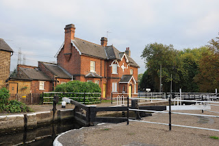
Any Tiff or Jpeg would suffice for this exercise.  I chose an image I had shot by the canal where I live that I had taken some months back.

When I opened the image in Photoshop I converted it to 16 bits per channel as instructed.  This is because I would have to make some strong adjustments which might create some banding in 8 bit.

I adjusted the curve to try and create what the image would have looked like when it was captured before the camera processor worked on it.


These are the images before and after the curve was adjusted. You can see that by adjusting the curve the image is a lot darker.


We can see from the histograms that the darker image has more tones to the left and the original image has more to the right and is more evenly balanced.  In the latter case, this is due to the fact that most of the levels available to represent tones are devoted to the brightest part of the image whilst the darkest parts - the shadows-  are represented by very few levels.  This has an implication for noise.  

The notes for this part of the exercise are incorrect because they tell you that the darker image should have the tones piled up in the right when it should be the left.  I have looked at the OCA website and this has been brought to their attention and will be re-written. 

Next I created a curve on the darker image in an attempt to get it looking as close as possible to the original image.  This is what the camera's processor does when we take an image.  


The most noticeable difference is to the darkest areas which have been lightened dramatically.

A note on Noise
If there is noise in an image it is concentrated in the shadows.  Before the camera processes the image it is buried from view within the dark areas of the image.  The strong curve that has to be applied to lighten the image to a normal appearance has the side-effect of exaggerating this noise as it lightens the shadow areas so strongly.

I examined a close up section of the images and noticed that there is some noise in the adjusted image.

Original

Adjusted image.  Noise is present. 

Linear capture

The camera sensor responds to light in a different way to our eyes and to film.  Linear is the way in which the camera reacts to light falling on it.  Our eyes and film compress the way we receive light so what may seem twice as bright is less so in our vision.  Our eyes can handle a wider range of brightness than the camera's sensor.

Although when we take a picture it may look like we would expect it to on our LCD display screen it is not the way in which the sensor has captured the image.  The camera processes the image for us and adjusts it so the image looks brighter when we get to see it.  If this processing didn't take place we would be left with a rather dark image.

If we shoot Raw we can get an unprocessed image from the camera and then process it ourselves using Photoshop of other image processing software.  Shooting raw gives you more control over your final image.

Gamma
The correction that the camera makes to your image image is called a gamma corrections curve which makes the shot look normal in appearance.

Example of a gamma correction curve.


What is gamma?
It's the term used in computing and to describe digital images.  When applied to monitor screens it is a measure of the relationship between voltage input and the brightness intensity. Because of the way in which computer monitors work a raw, uncorrected photo would look darker and more contrasty than our eyes would expect.

In compensating for this, gamma correction is applied by the camera post capture.  This usually makes the image brighter and less contrasty as it lifts dark tones more than light ones. 

In Lightroom you can adjust the tones using Tone Curve.  This helpfully highlights the area of the image that is being affected by the adjustment you are making to the curve.  


In this example, the word Lights is highlighted to show you that the area on the image that is being adjusted affects the lights in the image.

Assignment 1

I have received my feedback from my first assignment and my tutor has given me some suggestions for enhancing my workflow going forward.  I think as I have up until now not had a very structured workflow this is something I will work on and develop as I continue to shoot. I suppose it will be very much a work in progress.  I am new to much of the software I have now and as I continue to find my way around it I am sure that I will find ways of working with it that are better for me.

I have learnt quite a bit from this assignment and first part of the course.  In my normal working life I am a very structure and methodical person.  This is something that I haven't brought much to my photography or should I say to the same level as I have in my daily work.  The reasons for this probably stem from the fact that a lot of my shoots are unplanned, street photography, travel photography and some landscape work.

Some of the additions I will include in my next assignment/shoot include:

  • Writing down what I want to achieve on the shoot
  • Think about recording why and how I am going to shoot 
  • Researching what I am going to photograph - has it been captured before?  
  • What photographic approach will I adopt?
  • Outcomes.  What will they be?  Where will my images end up? 
I need to look also at explaining how I took the images or how I plan to take them more at the planning stages  of shoot.

I will also look at bracketing my exposures.  When I next have to alter the ISO due to shooting indoors or low light, I will look at shooting at differing ISOs.

I need to add some more structure to the preparation of the shoot and can do this by outlining the various aspects of it under the following headings:

  • Research
  • Time
  • Photographic approach
  • Logistics
  • Shot list
  • Specific ideas
  • Abstract ideas
  • Wider themes
These are the images I submitted

The Tower


The Rose Window


The hands of the Augustinian


The Swan


Jesse

The Arches


The Aisle

Bouquet


Part 2: Digital image qualities

This second part of the course looks at linear capture which is the way in which are images are captured using a digital camera.

We will also look at:
  • Highlight clipping (which we covered briefly in the first part)
  • Noise - which is something I am increasingly coming up against the higher my ISO is
  • Dynamic range
  • White balance and overall colour
 The assignment in this section is called 'Seeing like your camera' which is something that I have started working on when I explored exposure some months ago now.