The pen tool is the most accurate tool for making selections. This is the tool professional retouchers use for making selections with precision.
The other selection tools like the magic wand are good for making approximate selections but if you want accuracy you are going to have to learn how to use the pen tool. I think the fact that it is vector based is what puts many people off. It is not as straightforward to use at the other tools but once you get used to it you will never look back. Or so I am told.
The pen tool group includes the main pen tool, a freeform pen tool and the modifier tool to add, delete or modify the path points.
The pen tool has three operating modes. When in the Shape Layers mode you can use it to draw with. If you click on the Path modes button this allows you to create a pen path without adding a fill layer to the document.
I don't tend to make selections very often in my workflow. However, I have added becoming more familiar with the pen tool to my list of things I must do. It is just a matter of finding the time.
I do feel though that from the course I have learnt a lot more about selections and I am feeling more confident in making decisions about which tool to use rather than shying away from it altogether.
Thursday, 7 February 2013

Photoshop - Actions
Maybe it is just me but I was pretty excited to discover actions n my Photoshop course last month. Until now I hadn't realised such a feature existed.
Actions allow you to record a number of operations in Photoshop and then apply them to another picture or a number of images in a folder. They are application scripts that record a sequence of events like converting an image to monochrome. This sequence can then be replayed on other images.
These are really useful if you have a particular processing routine that you run in Photoshop. If you record this routine then you don't bother having to do it on every single image you process. I think actions would be beneficial to me for formatting images for output on the web. I can make the adjustments to one image while recording them and then play them over the entire folder I want to put online.
If there is a process in the sequence that you don't want to run you can stop that from being applied to other images by turning that action off.
I still feel that in my workflow I work better at the processing stage in Lightroom. I also feel like I want to consider each image individually and therefore running actions like monochrome conversions would not be suitable for me at the moment.
Actions allow you to record a number of operations in Photoshop and then apply them to another picture or a number of images in a folder. They are application scripts that record a sequence of events like converting an image to monochrome. This sequence can then be replayed on other images.
These are really useful if you have a particular processing routine that you run in Photoshop. If you record this routine then you don't bother having to do it on every single image you process. I think actions would be beneficial to me for formatting images for output on the web. I can make the adjustments to one image while recording them and then play them over the entire folder I want to put online.
If there is a process in the sequence that you don't want to run you can stop that from being applied to other images by turning that action off.
I still feel that in my workflow I work better at the processing stage in Lightroom. I also feel like I want to consider each image individually and therefore running actions like monochrome conversions would not be suitable for me at the moment.
Man Ray at NPG - BBC review
The BBC news website was running a piece on the Man Ray exhibition at the National Portrait Gallery which opens today. Exhibition closes 27 May.
Monday, 4 February 2013
An introduction to Man Ray
Man Ray was a modernist artist and significant contributor to the Dada and Surrealist movements in photography. He is best known for his avant-garde work and his portrait and fashion images.
He was born in 1890 in America to Russian-Jewish parents and showed his creative talents from an early age. Before working in photography he experimented with other art forms like painting and sculpture but it is his work in photography that he is best known for.
Some of his best work was produced for his Electricity portfolio consisting of ten images primarily photograms or rayograms as Ray renamed them. Solarized images have a degree of tonal reversal was a particularly good technique which allowed him to show pulsating energy.
His most famous image from this series is a portrait of his lover, photographer Lee Miller. We can see he has used montage and solarisation in this image. It is cropped tightly to give the appearance of a torso and an anonymous object. She is like a type of goddess. The new, modern energy system is rooted in the new goddess.

I feel there is a definite energy in this image. It is surreal and irrational. He has given us the opportunity to view the unviewable - electricity.
Looking back at my work on assignment 4 on this course I found myself at a crossroads in relation to my photography. This section forced me to delve into the unknown and leave the technical considerations behind. I realise now that my technical ability has improved which will enable me to become a lot more creative in my work.
I like May Ray's ability to capture things that we can't necessarily see like electricity for example. I am also keen to experiment with some of the techniques he has used in his work.
He was born in 1890 in America to Russian-Jewish parents and showed his creative talents from an early age. Before working in photography he experimented with other art forms like painting and sculpture but it is his work in photography that he is best known for.
Some of his best work was produced for his Electricity portfolio consisting of ten images primarily photograms or rayograms as Ray renamed them. Solarized images have a degree of tonal reversal was a particularly good technique which allowed him to show pulsating energy.
His most famous image from this series is a portrait of his lover, photographer Lee Miller. We can see he has used montage and solarisation in this image. It is cropped tightly to give the appearance of a torso and an anonymous object. She is like a type of goddess. The new, modern energy system is rooted in the new goddess.
"Of course, there will always be those who look only at technique, who ask 'how', while others of a more curious nature will ask 'why'. Personally, I have always preferred inspiration to information."
I like May Ray's ability to capture things that we can't necessarily see like electricity for example. I am also keen to experiment with some of the techniques he has used in his work.
The National Portrait Gallery is running an exhibition of Man Ray's portraits from 7 February to 27 May and I am looking forward to going. I feel that it will be a great opportunity to see more of his work and to learn more about surrealism in portraits.
Surrealism in photography
The Surrealist movement officially began with the publication of Andre Breton's Manifesto of Surrealism in 1924.
We are all familiar with the work of Dali who is undoubtedly the most famous surrealist painter. However, what exactly is surrealism and what is its role in photography?
Surrealists viewed the reason as a force that blocked the passage to their search for the imagination. To find the imagination they looked to the subconscious. In looking at the unconscious mind they explored dreams, intoxication, sexual fantasy and madness. Their quest was to find the inner beauty of a world we do not know.
Photography as an art form played a major role in the surrealist movement - the main protagonists being Man Ray and Maurice Tabard. Techniques like montage, double exposure, combination printing and solarization were used to capture the dream world they sought.
Solarization was a technique that was used in Man Ray's Electricity series. It is essentially where the image in a negative is totally or partially reserved in tone resulting in dark areas appearing white and vice versa. This is due to the halogen ions released within the halide grain during exposure diffusing the grain surface in adequate amounts to destroy the latent image. This method created a particularly surreal effect.
In this image by Tabard we can see many of the techniques at work. This provides a move away from traditional formalist photography and presents us with a world that is unknown to us.

In addition to these techniques, surrealist photographers looked to the meaning of a photograph and the fact that this meaning can change based on people's interpretation. This saw the snapshot, medical pictures and mugshots take on new meanings roles.
We are all familiar with the work of Dali who is undoubtedly the most famous surrealist painter. However, what exactly is surrealism and what is its role in photography?
Surrealists viewed the reason as a force that blocked the passage to their search for the imagination. To find the imagination they looked to the subconscious. In looking at the unconscious mind they explored dreams, intoxication, sexual fantasy and madness. Their quest was to find the inner beauty of a world we do not know.
Photography as an art form played a major role in the surrealist movement - the main protagonists being Man Ray and Maurice Tabard. Techniques like montage, double exposure, combination printing and solarization were used to capture the dream world they sought.
Solarization was a technique that was used in Man Ray's Electricity series. It is essentially where the image in a negative is totally or partially reserved in tone resulting in dark areas appearing white and vice versa. This is due to the halogen ions released within the halide grain during exposure diffusing the grain surface in adequate amounts to destroy the latent image. This method created a particularly surreal effect.
In this image by Tabard we can see many of the techniques at work. This provides a move away from traditional formalist photography and presents us with a world that is unknown to us.
In addition to these techniques, surrealist photographers looked to the meaning of a photograph and the fact that this meaning can change based on people's interpretation. This saw the snapshot, medical pictures and mugshots take on new meanings roles.
Dadaism in photography
Dadaism was an art movement born out of the horrors of the first world war. As a movement it had strong anti-war politics and was anti-bourgeois. It rejected logic and welcomed the irrational. It was the beginning of abstract art and laid the groundwork for movements like surrealism and postmodernism.
In photography this rejection of reason and logic manifested itself in the use of the photomontage. We can see this at play in the work of Hannah Hock. Her image Cut with the Kitchen Knife Dada through the Last Weimar Beer Belly Cultural Epoch of Germany focuses on Dada's dissatisfaction with the Weimar Republic. We can see various slogans in the image like 'Anti-Dada movement' pasted over portraits of Wilhelm II.
In essence Dada in photography introduced artists that were anti-pictorialist. In Europe these photographers saw photography as a cultural force and viewed it as socially progressive. Fine art was being replaced by an art based on popular culture. Art was to be for the proletariat and would become a force for social change.

(C) Hannah Hock
Hock was particularly focused on the role of women in society and the method of cutting out images with a scissors to make an image provided a link to the domestic realm.
In this image we can see that women have a role to play. The image hints at women's suffrage and their domestic situation. She contrasts traditional domesticity with images of progressive women like actresses and poets.
Other photographers that were influenced by the Dada movement include Man Ray, Aleksandr Rodchenko, Laszlo Maholy-Nagy and El Lissitzky.
If we look at Lissitzky's famous photomontage The Constructor we see an image from his self portrait series. It is a modernist statement. He produces a collage of future man using his head, hands and other instruments like a compass. There compass has drawn a circle which acts like a halo for this prophet.

Thursday, 31 January 2013
Revisiting noise reduction
I've already covered noise reduction earlier in the course but I have also covered it recently on my Photoshop course.


The best way to avoid noise in your images is not to shoot at a high ISO. However recently I have been shooting indoors a lot in places where flash and tripods are not allowed so I have had to crank up the ISO. I have noticed that on my D700 I can increase the ISO without getting as much noise as I have with the D90.
To reduce the amount of noise I have in some of these images I use the Noise reduction sliders in Lightroom. These are found under the Deatil menu.

If you want to reduce the colour noise you can drag the Colour slider to the right to reduce it.
The Detail slider controls how the edges of your image are affected by the noise reduction. If you drag it too far over you will run the risk of introducing colour speckles so it is best to keep this to a minimum.
To reduce grain drag the Luminance slider till the noise is greatly reduced. The Detail slider if dragged too far to the right can make your image more noisy. It is difficult to have cleanness and detail in a noisy image. You have to make the decision which to sacrifice.
I have used this image as an example. This was shot at ISO 1600.

If we look a little more closely at the noise we can see that it is a bit grainy.
Luminance slider increased to 55
We can see that the noise has been reduced significantly.
Noise can be reduced in RAW images in ACR. We have the same sliders to work with and they produce the same effects at Lightroom.

Noise can also be reduced in Photoshop using the Channels Panel. This type of noise reduction concentrates on reducing noise in colour channels as there is often significantly more noise in a single colour channel than others.
When you look at the colour channels it is possible to loo at each colour individually. The blue channel tends to have the most noise.
Using the Filter menu, select Noise and then Noise Reduction. In the Advanced option you can reduce thte noise by colour channel.

I think that the methods that I find work best for me is to use Lightroom or ACR to reduce noise. I think the Photoshop method would be good for a noisy JPEG but I rarely tend to shoot JPEG only so I don't have this problem.
I think introducing noise reduce at the processing RAW image stage works best for my workflow.
Tuesday, 29 January 2013
Looking at colour managment and colour space
On my Photoshop course we looked at colour management. I have read a lot about it but it was a good opportunity for me to find out if I was on the right track and had understood everything I had read. I do find learning some of this stuff from a book soul destroying at times so I was pleased to have some face to face tuition on this subject.
The specific problems we encounter with colour management is when our images on screen don't match those that we have printed.
There are three Digital colour systems:

- RGB - Red, Green and Blue channels. Colour in relation to screens and cameras
- CMYK - Cyan, Magenta, Yellow and Key. This relates to printing
- LAB - lightness, green to red, blue to yellow channels
The most common systems that we encounter on a daily basis would be RGB and CMYK.
In order for our on screen images to match our prints we need to use a universal colour management system - ICC. This ensures that all software and hardware are adhering to a set of specific colours. Prior to this printer manufacturers had colour systems unique to them which made printing a big issue.
We can use a tool like Color Checker to set a profile for our cameras as cameras tend to render some colours differently. You would do this if getting the colours 100% accurate was very important for a specific image.

Colour space is essentially the colours you decide to work with on your computer. There are a number of colour spaces:
- sRGB
- Adobe RGB (1998)
- ProPhoto RGB (this is the widest range)
This graph shows us the difference in colour numbers is each of the above. As we can see ProPhoto offers the most colours, more possibly than the naked eye can see.

In order to ensure your monitor accurately displays colours you need to profile it regularly using a tool like ColorMunki. I do this on a regular basis and I have found that my prints are now more accurate than before. I don't tend to have colours that vary too much although there might be slight variations. I still have problems with black and white images at times though as they often come out with a pink hue.
In my workflow I have added colour space - I will use RGB for website and screen work and Adobe RGB for print. This would mean having two separate files for a single image if you were going to use it online and then print it.
In relation to camera settings I always shoot RAW so therefore I do not need to adjust camera settings as I will set the colour space in Lightroom or Photoshop.
Monday, 28 January 2013
Imaginery view: An exhibition by Dan Tobin Smith and Rachel Thomas
On a recent visit to Somerset House I stumbled upon this exhibition by photographer Dan Tobin Smith and designer Rachel Thomas. It is a personal project for both artists and it appears that this is just thet start of Imaginery View and there is more to come in the future.
This is a very unusual exhibition in that it consists of a series of photographs of landscapes the artists crafted from polystyrene. These polystyrene models are deceptively huge - you can get a sense of scale as some of the sculptures are displayed alongside the photographs. This adds a different dimension to the exhibition - one of intrigue and illusion.
I like the milky white world they have created. This has been achieved through Tobin Smith's use of light, smoke and that heat haze blur you see in distant landscapes on a hot day.
The polystyrene provides an interesting texture and it doesn't decompose which makes it interesting in relation to the subject.
I like the use of black and white in this work. If colour had been used it would have spoiled the element of disguise. When I first looked at the images I didn't for a minute think they were constructed out of polystyrene - I actually thought they were somehow real.
This exhibition shows what can be achieved through the medium of photography and a lot of creativity. It has also given me some food for thought on the different uses of black and white and what can be achieved with the use of light and smoke in photography.
A number of the images can be seen here
They have a dedicated wesbite for the exhibition
http://imaginary-view.com/
This is a very unusual exhibition in that it consists of a series of photographs of landscapes the artists crafted from polystyrene. These polystyrene models are deceptively huge - you can get a sense of scale as some of the sculptures are displayed alongside the photographs. This adds a different dimension to the exhibition - one of intrigue and illusion.
I like the milky white world they have created. This has been achieved through Tobin Smith's use of light, smoke and that heat haze blur you see in distant landscapes on a hot day.
The polystyrene provides an interesting texture and it doesn't decompose which makes it interesting in relation to the subject.
I like the use of black and white in this work. If colour had been used it would have spoiled the element of disguise. When I first looked at the images I didn't for a minute think they were constructed out of polystyrene - I actually thought they were somehow real.
This exhibition shows what can be achieved through the medium of photography and a lot of creativity. It has also given me some food for thought on the different uses of black and white and what can be achieved with the use of light and smoke in photography.
A number of the images can be seen here
They have a dedicated wesbite for the exhibition
http://imaginary-view.com/
Klein/Moriyama study visit
On 12 January I attended the OCA study visit to the Klein/Moriyama exhibition at the Tate.
In preparation for the visit I watched the BBC’s Imagine programme – The Many of Lives of William Klein which I recorded before Christmas. I also watched the Tate video on Daido Moriyama. I relied on the internet for further research and viewing of images.
From my first impressions of their work I feel I had a tendency towards Klein finding his work personally more interesting and possibly familiar. Moriyama’s work seemed to present some kind of barrier or distance and I found it hard to digest his images finding them dark and often impenetrable. One of the first questions I asked myself was why a joint exhibition?
Moriyama was influenced by the work of Klein would be the most obvious answer to that question but was that it? Their work on first glance may seem similar – black and white images of life on city streets – but on closer inspection they are very different.
The fact that both worked in each others’ cities would perhaps be a stronger parallel. Although Moriyama’s New York is a very different city to the one we see in Life is good and good for you in New York. Likewise can be said for Klein’s Tokyo.
The exhibition begins with Klein’s work, more specifically his film Broadway by Light, where we are introduced to the city’s gaudy neon signs – a forerunner of pop art. We see Klein the artist as he was more than simply one of the greatest photographers to come out of the US as this exhibition shows us.
Rooms 2 and 3 display the images that were to make up Klein’s first book – a photo diary of New York – an idea which would lead to further diaries of Rome, Tokyo and Moscow. After living in Paris he returned to New York to work as a fashion photographer. During this time he began work on his photo diary where he saw the city – his home town – from the eyes of an outsider. The result is a collection of candid shots of life in New York in the 50s.
I found Klein’s use of a wide angle lens very interesting. In all his images the viewer feels part of what is happening as the photographer is part of the action. It is very different from Henri Cartier-Bresson the man who inspired Klein. My own personal experiments with street photography have usually involved the use of a medium to telephoto lens which introduces a distance in the image. I feel that moving forward I would like to experiment more with a wide angle lens in the hope of injecting some energy into my street work.
I also find the interaction with the subjects in his images. It is clear that he is not being conspicuous. They are very much aware of his presence. However, true street photographers would argue that the essence of this genre is to capture life on the street without interacting with the subjects. This interaction can lead to a more posed shot and a subject who is aware of the camera behaving differently. However, I feel the interaction and awareness of the photographer in Klein’s work displays an intimate moment that might have been lost otherwise.
Rooms 4 and 5 look at Klein’s earlier work as an abstract painter and provide a necessary background if you are attempting to discover where he is coming from. I feel that this background as a painter and an abstract painter led to Klein’s experiments with his images in Contacts. In this series he experimented with blowing up his contact sheets and using a red pencil/enamel paint he shows the chosen image. Again we see his work moving into the pop art world.
If Klein’s exhibition is wide and varied in size and subject matter with large prints and film, Moriyama’s introduction is almost understated. I feel that is it a disservice to the artist that his work is presented after Klein’s in the exhibition. Klein’s work has stimulated all the senses and finishes with the bright colourful Contact images. When entering Moriyama’s exhibition the images are small and black and white and I couldn’t help feel it was a bit of an anti-climax.
I feel that also due to the sheer volume of work displayed in Klein’s rooms the exhibition goer is probably suffering from fatigue and information overload by the time they come to view Moriyama’s work. I know I was and from talking to other people on the study visit many of them had already been before or were planning to go again.
As Moriyama works with the intentions of publishing his images in books I feel that this has an impact on the images exhibited. They are small (possibly to replicate the experience of viewing a book) and difficult to adapt to after Klein’s work.
Moriyama’s work in contrast to Klein’s is very dark and sinister. The high contrast black and white and graininess of his images makes for hard viewing and demands a lot of the viewer. They are not pretty but then they don’t have to be, but they do portray Tokyo as a very dark, unwelcoming place.
Where Klein’s New York is vibrant and full of energy Moriyama’s New York is seen from the view of a cultural outsider. His streets are bare and his people do not have the energy and intimacy we see in Klein’s work. I feel that they are images resulting from an outsider looking in who has not connected with his subjects or the place. There is a sense of loneliness and not belonging. This sense of loneliness and not belonging is how I feel about Moriyama’s work myself. It is a world that is culturally very different to ours. It is unfamiliar. It makes me feel uneasy.
I feel the reasons why I prefer the work of Klein can be summarised as follows:
- The order in which they are presented tends to favour Klein as does the variety of work presented.
- The cultural language of Moriyama’s work is a challenge. It is unfamiliar territory. It presents a barrier that I found hard to get over.
- There is humour in Klein’s work that I don’t feel there is in Moriyama’s
- In the film on Klein you can associate more with him
- More subjects in Klein’s work – a more diverse range.
Some of the parallels in their work
- Both worked in the city, but the city meant different things to them. Moriyama in his film says that he can’t make photographs without a city.
- Post production work and the re-working of old images can be seen in Moriyama’s dog image and Klein’s Contacts
- Both willing to push the limits of photography and introduce other ways of making the final image.
Sunday, 20 January 2013
Assignment 5 feedback
I have been going through my feedback from my tutor on the last assignment of this course and overall I feel it is pretty positive. In fact it is probably the best feedback I have received of all the assignments I have submitted.
I found this subject - time - pretty challenging to capture so I was glad to get feedback that reflected this and stated that I had 'done well in pursuing the development of my exploration of time'. He also said that it was 'good to see you thinking about the topic and not just how best generally to represent it photographically but more importantly how I want to'. He then mentioned that this my progression to'developing your own voice'. Yes the 'voice' word. I have struggled for so long wondering what my voice would be, how you would know when you are on the way to finding it and whether I would ever have a 'voice'.
On the images itself there were a few minor technical issues - adding a little contrast to one or two and a tighter crop suggested for the last image of the series. I have to saw that I agree with the contrast but I do not want to crop out the left hand side of the last image - Out of darkness cometh light.

This side of the image for represents the past, or a darker side of life. Having the dark passage beside the light to me presents a challenging contrast to the viewer - which path to take or which place have you come from.
For this reason I believe I want to leave the image as it is.
Comments were also made about about image 5 which contains some noise which would be visible if the image was to printed enlarged. This could be re-visited if I felt the need to enlarge the shot.
Overall I feel that this was an enjoyable assignment to complete and has given me a theme to continue working on in the future. Time is a huge subject and I look forward to discovering new ways to represent. I also look forward to seeing if time comes to have a different meaning for me as I grow older or my circumstances change.
I found this subject - time - pretty challenging to capture so I was glad to get feedback that reflected this and stated that I had 'done well in pursuing the development of my exploration of time'. He also said that it was 'good to see you thinking about the topic and not just how best generally to represent it photographically but more importantly how I want to'. He then mentioned that this my progression to'developing your own voice'. Yes the 'voice' word. I have struggled for so long wondering what my voice would be, how you would know when you are on the way to finding it and whether I would ever have a 'voice'.
On the images itself there were a few minor technical issues - adding a little contrast to one or two and a tighter crop suggested for the last image of the series. I have to saw that I agree with the contrast but I do not want to crop out the left hand side of the last image - Out of darkness cometh light.

This side of the image for represents the past, or a darker side of life. Having the dark passage beside the light to me presents a challenging contrast to the viewer - which path to take or which place have you come from.
For this reason I believe I want to leave the image as it is.
Comments were also made about about image 5 which contains some noise which would be visible if the image was to printed enlarged. This could be re-visited if I felt the need to enlarge the shot.
Overall I feel that this was an enjoyable assignment to complete and has given me a theme to continue working on in the future. Time is a huge subject and I look forward to discovering new ways to represent. I also look forward to seeing if time comes to have a different meaning for me as I grow older or my circumstances change.
Saturday, 19 January 2013
The best way to do non global sharpening
There are different ways in which you can sharpen your images and I have carried out some of these in an earlier exercise on this course.
From my Photoshop course I have learnt that the best way to sharpen your images - the non-destructive way - is to use layer masks. This means that your original image is not affected by the sharpening. It is paramount that you protect your images as much as possible in the processing stage.
Whilst you can use the eraser tool to remove sharpened areas from your image the best way to do this is by using the Smart sharpen tool and layer masks. You can then use a paintbrush to paint over the face or areas that you don't want to sharpen. This ensure that the image below is protected.
This method is particularly useful when sharpening portraits where you don't want the face to be over-sharpened.
Prior to attending this course I wasn't aware of the damage my processing may be doing to the image below. Perhaps this is a reason why I should move away from using Lightroom for most of my processing.
From my Photoshop course I have learnt that the best way to sharpen your images - the non-destructive way - is to use layer masks. This means that your original image is not affected by the sharpening. It is paramount that you protect your images as much as possible in the processing stage.
Whilst you can use the eraser tool to remove sharpened areas from your image the best way to do this is by using the Smart sharpen tool and layer masks. You can then use a paintbrush to paint over the face or areas that you don't want to sharpen. This ensure that the image below is protected.
This method is particularly useful when sharpening portraits where you don't want the face to be over-sharpened.
Prior to attending this course I wasn't aware of the damage my processing may be doing to the image below. Perhaps this is a reason why I should move away from using Lightroom for most of my processing.
Advanced Photoshop course
I recently wrote about how I had enrolled on a Photoshop course at City Lit. The course covers advanced skills in Photoshop for photographers.
The course is run using the latest version of Photoshop CS6 Mac version. I don't own a Mac so it will be interesting to work on one. I don't think the learning curve will be that steep on warrant me to go on their short course for using Apple Macs.
The course aims to introduce me to the following tools and techniques:
The course is run using the latest version of Photoshop CS6 Mac version. I don't own a Mac so it will be interesting to work on one. I don't think the learning curve will be that steep on warrant me to go on their short course for using Apple Macs.
The course aims to introduce me to the following tools and techniques:
- layer masks, paths and alpha channels ( I know a little about layer masks)
- clipping and stroking paths
- adjustment layers
- blending modes
- layer styles
- layer groups and layer comps
- actions
- batch action and droplets
- colour management
- processing raw files
- high dynamic range
- Adobe Bridge
Most of the above will be new to me but I have what I would think is a good grasp on using layers and blending modes and HDR. I am also pretty competent when it comes to processing raw files.
I think for me Lightroom replaces Bridge.
I do feel that I need some help with colour management. Although I have a good understanding on it I just feel that I need a little guidance on some areas and perhaps the verification that what I know is correct.
I will post relevant findings/learning/outcomes on my blog.
Learning outcomes
I have now completed the course and I feel that I have gained a lot of confidence in my ability to use Photoshop. Overall I am pleased that I went on the course and I found it very useful. It also gave me the opportunity to network with other photographers - professional and amateur - which was enlightening.
Learning outcomes
I have now completed the course and I feel that I have gained a lot of confidence in my ability to use Photoshop. Overall I am pleased that I went on the course and I found it very useful. It also gave me the opportunity to network with other photographers - professional and amateur - which was enlightening.
- Knowledge of actions and how they can be used to improve my workflow
- Clarification (at last) on layers, layer masks and the best practice for applying them
- Improved knowledge on colour management. I feel it is finally making sense for me and the pieces of the puzzle fit together
- New ways of converting images to black and white.
- Duotones are a bit dated
- Blending modes and when to use them. This was especially useful when I looked at assignment 4 again.
- Better knowledge of clone stamp tool
- The pen tool. I feel though that I would need to practice a lot more with this tool to improve.
- Knowledge of other ways of making selections other than using the magic wand or lasso tool.
- Using channels
- HDR and ways to use it. I have played around with HDR during this course but I'm not sure how I would use it in my day to day working. I can see the benefits of it but I'm not sure if I really like the HDR effect we see in currently trending in landscapes
Assignment 5 - Personal project
For this assignment I worked on the concept of time. I have outlined my proposal for this piece of work in an earlier post.


Cyclical time


I divided my work into the following sections:
- Seeing time
- The cyclical nature of time
- Personal vision of time
Seeing time

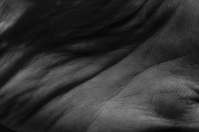
The palm of my hand

Layers

A time and place

Old and new
Cyclical time

One sixth of a second
Day and night


Seasons


Personal vision of time

Out of darkness cometh light
Thursday, 22 November 2012
Ansel Adams - Photography from the Mountains to the Sea
I had a free day today so I headed down to Greenwich to the National Maritime Museum to see the new Ansel Adams exhibition - Ansel Adams - Photography from the Mountains to the Sea.
It was the first time I had been to a photography exhibition at the Maritime Museum having only visited there once but it proved to be a good location.
The exhibition focussed on Adams work with water - rivers, lakes, waterfalls, snow, ice and rain.
Before going to the exhibition I wasn't sure what to expect other than a series of perfectly exposed (Adams is the creator of the Zone System) black and white landscape images. I like Adams work but I must admit studying the Zone System and reading The Negative earlier this year kind of threw me a bit and gave me a bit of a mental block every time I've heard his name since. However, I wasn't going to let this put me off.
The exhibition looked at the following areas:
Beginnings
Pictorialism V Modernism - Adams saw the camera as something different to traditional photographers. He wanted to let the camera speak for itself and move away from the painted look photography believing that photographs do not have to look like paintings.
The images in this section look at some of his earliest work including some of his first images taken at the age of 13. We can see a young Adams developing an interest in representing the sea in all its glory. His images of Helmet Rock, Lands End show his interest in the contrasting elements of solid rock and the crashing waves frozen in time. Instead of opting for milky waters he set out to capture the moment and 'interpret the power of falling water, the light and airy manner of the spray particles and the glimmer of sunlit water' as can be seen in Diamond Cascade, Yosemite National Park 1920.
We can also see Adams beginning to play with the mirror lakes - reflections of the mountains and scenery in the water in front of the lens.
Sea and Surf
Here in this set of images we find his Surf Sequence where he set out to capture a wave as it hit against the shore and then moved back again. He was very concerned with the way in which water changed with time. He used the faster shutter speed to capture many of these shots showing something only the camera can show because it's action is faster that the human eye can see.
Coast
This set of photographs centres on 'extracts' from shipwrecks in San Francisco. Adams didn't believe that you can have abstract images as the photograph was a representation of what was in front of you. Instead he referred to them as extracts as the photography chooses the order to make out of the chaos in front of the lens.
I particularly liked these images as they were different from the landscapes associated with Adams and they also showed his skill at working with grids and sequences.
Rivers
These photographs mainly consisted of snaking rivers through the Yosemite National Park.
Waterfalls
Adams was a believer in the ability to express personal experience through photography. Looking to Steiglitz's Equivalents, Adams idea of equivalency meant that the photograph should correspond to to an artist's emotional state at the time it was made.
The waterfalls images contain photographs from Yosemite where he has captured the cascades at full force as in Waterwheel Falls and through the use of longer exposure Fern Spring Dusk.
Rapids
In this collection of work we are introduced to the f/64 school and from this period onwards we see Adams shooting at the smallest aperture to creature sharper images throughout the frame.
Surface and Texture
Black and white is a good medium for showing texture and surface detail and Adams images here are no different. They are extracts from water views with subjects ranging from limpets to grass.
Snow and ice
Some stunning images in this collection including Frozen Lake and Cliffs where he was satisfied to get the image as in a few days it (the snow) would be gone. Again we see the impact time has in his work.
Geysers
Again the focus is the Old Faithful Geyser in Yellowstone National Park.
Interviews
As part of the exhibition, a couple of short interviews with Adams from the BBC were being played in the video area. It was interesting to see the man himself after seeing all his work. He came across as being more down to earth than perhaps we are led to believe. He spoke about his influences and how he got his exposure spot on. On being asked about bracketing he replied it was 'a sign of insecurity'.
What I learned from the visit
As part of the display there was an area where people could look at his books and also post notes about how Ansel Adams inspired them to...
There was a school visiting at the time I was there and I think one of the comments left by one of the kids will stay with me
Ansel Adams inspired me to... Grow a beard and be a good person.
As for me it has to be work harder!!!
It was the first time I had been to a photography exhibition at the Maritime Museum having only visited there once but it proved to be a good location.
The exhibition focussed on Adams work with water - rivers, lakes, waterfalls, snow, ice and rain.
Before going to the exhibition I wasn't sure what to expect other than a series of perfectly exposed (Adams is the creator of the Zone System) black and white landscape images. I like Adams work but I must admit studying the Zone System and reading The Negative earlier this year kind of threw me a bit and gave me a bit of a mental block every time I've heard his name since. However, I wasn't going to let this put me off.
The exhibition looked at the following areas:
Beginnings
Pictorialism V Modernism - Adams saw the camera as something different to traditional photographers. He wanted to let the camera speak for itself and move away from the painted look photography believing that photographs do not have to look like paintings.
The images in this section look at some of his earliest work including some of his first images taken at the age of 13. We can see a young Adams developing an interest in representing the sea in all its glory. His images of Helmet Rock, Lands End show his interest in the contrasting elements of solid rock and the crashing waves frozen in time. Instead of opting for milky waters he set out to capture the moment and 'interpret the power of falling water, the light and airy manner of the spray particles and the glimmer of sunlit water' as can be seen in Diamond Cascade, Yosemite National Park 1920.
We can also see Adams beginning to play with the mirror lakes - reflections of the mountains and scenery in the water in front of the lens.
Sea and Surf
Here in this set of images we find his Surf Sequence where he set out to capture a wave as it hit against the shore and then moved back again. He was very concerned with the way in which water changed with time. He used the faster shutter speed to capture many of these shots showing something only the camera can show because it's action is faster that the human eye can see.
Coast
This set of photographs centres on 'extracts' from shipwrecks in San Francisco. Adams didn't believe that you can have abstract images as the photograph was a representation of what was in front of you. Instead he referred to them as extracts as the photography chooses the order to make out of the chaos in front of the lens.
I particularly liked these images as they were different from the landscapes associated with Adams and they also showed his skill at working with grids and sequences.
Rivers
These photographs mainly consisted of snaking rivers through the Yosemite National Park.
Waterfalls
Adams was a believer in the ability to express personal experience through photography. Looking to Steiglitz's Equivalents, Adams idea of equivalency meant that the photograph should correspond to to an artist's emotional state at the time it was made.
The waterfalls images contain photographs from Yosemite where he has captured the cascades at full force as in Waterwheel Falls and through the use of longer exposure Fern Spring Dusk.
Rapids
In this collection of work we are introduced to the f/64 school and from this period onwards we see Adams shooting at the smallest aperture to creature sharper images throughout the frame.
Surface and Texture
Black and white is a good medium for showing texture and surface detail and Adams images here are no different. They are extracts from water views with subjects ranging from limpets to grass.
Snow and ice
Some stunning images in this collection including Frozen Lake and Cliffs where he was satisfied to get the image as in a few days it (the snow) would be gone. Again we see the impact time has in his work.
Geysers
Again the focus is the Old Faithful Geyser in Yellowstone National Park.
Interviews
As part of the exhibition, a couple of short interviews with Adams from the BBC were being played in the video area. It was interesting to see the man himself after seeing all his work. He came across as being more down to earth than perhaps we are led to believe. He spoke about his influences and how he got his exposure spot on. On being asked about bracketing he replied it was 'a sign of insecurity'.
What I learned from the visit
- The importance of printing in Adams work. He manipulated all his images darkening the skies to add mood and drama. He has been known to work for up to an entire day on one image getting the print exactly how he needed it.
- There are two ways to take a picture you can accept what the camera reading gives you and click and hope for the best or you can visualise the image before you shoot and that will determine your settings etc.
- Adams use of composition - stretched the rule of thirds and made it work. I grew up beside the sea and in many of his images I saw what is the familiar to every coastal area however his use of crop, his making sense of the chaos in front of him is what makes his shots truly amazing.
- The theme of time ran through all this work. This is something I need to think about as I continue to develop my work on Time.
- Hard work and meticulous planning pays off in the end. Adams worked every day of the week, year in, year out and never took holidays.
- The prints were very small and hard to see. I preferred those that were larger - they enables you to see the detail in his work.
- Adams was ahead of his time in relation to his work with the environment and nature at a time when everyone was preoccupied with documentary photography. It is only probably now that we can see the true value of his legacy.
As part of the display there was an area where people could look at his books and also post notes about how Ansel Adams inspired them to...
There was a school visiting at the time I was there and I think one of the comments left by one of the kids will stay with me
Ansel Adams inspired me to... Grow a beard and be a good person.
As for me it has to be work harder!!!
Wednesday, 21 November 2012
Photoshop course
I have finally enrolled on an Advanced Photoshop course for Photographers at City Lit and I start this Friday.
Distance learning works for some subjects but for me teaching yourself Photoshop just didn't work. Perhaps if I was more of a techie person I would have loved the challenge but sadly I'm not.
I think a classroom set up will be more beneficial for me. I have tried learning new techniques and creative challenges from magazines and online videos but have failed miserably. Most of the time I get half way through the instructions only to find that I can't go any further and spend hours then trawling the internet trying to find out why. All this leads to is frustration!
I get the basics but I would like to take it to the next level and get more creative.
The course finishes in 5 weeks so by Christmas I hope to be able to show off some of my new skills.
Fingers crossed...
Distance learning works for some subjects but for me teaching yourself Photoshop just didn't work. Perhaps if I was more of a techie person I would have loved the challenge but sadly I'm not.
I think a classroom set up will be more beneficial for me. I have tried learning new techniques and creative challenges from magazines and online videos but have failed miserably. Most of the time I get half way through the instructions only to find that I can't go any further and spend hours then trawling the internet trying to find out why. All this leads to is frustration!
I get the basics but I would like to take it to the next level and get more creative.
The course finishes in 5 weeks so by Christmas I hope to be able to show off some of my new skills.
Fingers crossed...
Mario Testino and his use of colour
Last week I visited the National Portrait Gallery and stumbled upon Mario Testino's British Royal Portraits.
The display consists of photographs of the Royal Family taken between 2003 and 2010 and includes the engagement photos of the Duke and Duchess of Cambridge.
Although I am not a huge fan of the Royal family I quite enjoyed these images. I particularly liked Testino's use of colour and black and white.
From my studies on this course I know what makes a for a good black and white composition but lines and texture, shape and form are not always as easy to see when shooting people.
The first images in the display was the engagement photograph of William and Kate. I liked the soft focus and colours. The image looked slightly grainy and with the weak colours the image had an air of freshness about it. The subjects looked relaxed and happy and the crop was close up and tight which gave an intimacy to the shot.
If we compare that to the more formal engagement shot that Testino took the colours are stronger and the pose less formal and relaxed. The subjects look more mature and serious rather than the loved up couple of the first image.
Testino shot both William and Harry on their 21st birthdays. William's portrait shows him in a tuxedo a young man coming of age. Testino opted for black and white here which I feel adds to the tone and focuses the viewer on the prince and his expression.
In contrast, Harry is shown working on a motorbike on his 21st birthday. We can easily see who is destined to be king and who has the freer life, less weight on his shoulders and the pressures of life as a leader ahead of him. We are given an insight into the playful and daredevil nature of Harry but we are not allowed to see beyond the layer of sophistication for the future king.
Testino did not use black and white for all the formal portraits as can be seen in his shot of Prince Charles with his two sons. The shot is pretty high key and light which gives a fresh feel to the image. Their poses are relaxed and casual and they are letting us see the intimate side to their relationship. Unlike many black and white images we see of people this image looks modern and not old fashioned or dated.
The more formal portraits of Prince Charles on his own and also with Camilla tend to have stronger colours and more regal backgrounds.
I think what I liked the most about this display was the fact that I didn't care too much for the Royal family before I viewed them but now I feel like I have been given an insight into their personal lives.
The display consists of photographs of the Royal Family taken between 2003 and 2010 and includes the engagement photos of the Duke and Duchess of Cambridge.
Although I am not a huge fan of the Royal family I quite enjoyed these images. I particularly liked Testino's use of colour and black and white.
From my studies on this course I know what makes a for a good black and white composition but lines and texture, shape and form are not always as easy to see when shooting people.
The first images in the display was the engagement photograph of William and Kate. I liked the soft focus and colours. The image looked slightly grainy and with the weak colours the image had an air of freshness about it. The subjects looked relaxed and happy and the crop was close up and tight which gave an intimacy to the shot.
If we compare that to the more formal engagement shot that Testino took the colours are stronger and the pose less formal and relaxed. The subjects look more mature and serious rather than the loved up couple of the first image.
Testino shot both William and Harry on their 21st birthdays. William's portrait shows him in a tuxedo a young man coming of age. Testino opted for black and white here which I feel adds to the tone and focuses the viewer on the prince and his expression.
In contrast, Harry is shown working on a motorbike on his 21st birthday. We can easily see who is destined to be king and who has the freer life, less weight on his shoulders and the pressures of life as a leader ahead of him. We are given an insight into the playful and daredevil nature of Harry but we are not allowed to see beyond the layer of sophistication for the future king.
Testino did not use black and white for all the formal portraits as can be seen in his shot of Prince Charles with his two sons. The shot is pretty high key and light which gives a fresh feel to the image. Their poses are relaxed and casual and they are letting us see the intimate side to their relationship. Unlike many black and white images we see of people this image looks modern and not old fashioned or dated.
The more formal portraits of Prince Charles on his own and also with Camilla tend to have stronger colours and more regal backgrounds.
I think what I liked the most about this display was the fact that I didn't care too much for the Royal family before I viewed them but now I feel like I have been given an insight into their personal lives.
Thursday, 25 October 2012
Long exposure photography
I have been following @flixelpix on Twitter for a few months now. I think I originally was just looking for landscape photographers to follow and I stumbled across him.
The majority of his images are long exposures - something I have only dabbled with in the past and a little again recently. Flixepix has recently brought out an ebook on this technique and at the expense of a few pounds I thought I would take a look. I also wanted to look into how he published his book and put it together.
The book explains what long exposure photography is, how you shoot it, the gear you need and how to process your shots in Lightroom.
I suppose most of this I knew already but I was looking for something to reinforce for me whether I actually had 'got' long exposure right. And the answer was most of it.
I think I didn't consider taking long exposures during the day. Now you can thanks to 10 stop ND filters. I have used ND filters in the past but nothing like a 10 stop one. I've had a quick look online too and they are pretty expensive so it may be some time before I get to experiment.
I also liked the way in which he explained how to calculate the exposure time. In the past I just tended to randomly have a guess and then keep my fingers crossed as I waited to see what the image would look like in camera display and gauge from there.
The book did clear up a few niggling questions that I had in relation to things like Long Exposure Noise reduction and some of the equipment used, so I suppose it was worth investing a few quid in.
I plan to used some long exposure images in my final project for DPP. I have completed a recce of the location - it may involve water but is not the sea!
For more information check out the website - http://www.flixelpix.com/
Here are some shots I have taken at night during my last trip to the west of Ireland in August.


The majority of his images are long exposures - something I have only dabbled with in the past and a little again recently. Flixepix has recently brought out an ebook on this technique and at the expense of a few pounds I thought I would take a look. I also wanted to look into how he published his book and put it together.
The book explains what long exposure photography is, how you shoot it, the gear you need and how to process your shots in Lightroom.
I suppose most of this I knew already but I was looking for something to reinforce for me whether I actually had 'got' long exposure right. And the answer was most of it.
I think I didn't consider taking long exposures during the day. Now you can thanks to 10 stop ND filters. I have used ND filters in the past but nothing like a 10 stop one. I've had a quick look online too and they are pretty expensive so it may be some time before I get to experiment.
I also liked the way in which he explained how to calculate the exposure time. In the past I just tended to randomly have a guess and then keep my fingers crossed as I waited to see what the image would look like in camera display and gauge from there.
The book did clear up a few niggling questions that I had in relation to things like Long Exposure Noise reduction and some of the equipment used, so I suppose it was worth investing a few quid in.
I plan to used some long exposure images in my final project for DPP. I have completed a recce of the location - it may involve water but is not the sea!
For more information check out the website - http://www.flixelpix.com/
Here are some shots I have taken at night during my last trip to the west of Ireland in August.


David Goldblatt at the Barbican
As part of the Barbican's new exhibition Everything was Moving: Photography from the 60s and 70s, I attended In Conversation with David Goldblatt...
This exhibition surveys photography from an international perspective and includes the work of photographers from around the globe who worked during those decades.
It features 12 key figures including Bruce Davidson, William Eggleston, David Goldblatt, Graciela Iturbide, Boris Mikhailov,Sigmar Polke, Malick Sidibé, Shomei Tomatsu, and Li Zhensheng as well as important innovators whose lives were cut tragically short such as Ernest Cole, Raghubir Singh andLarry Burrows.
David Goldblatt's work has a sharp and subtle take on on life in South Africa under apartheid and in this session he discussed his work with the London based duo - Adam Broomberg and Oliver Chanarin.
Goldblatt spoke of his latest project - portraits of offenders at the scene of the crime. He was inspired by the violence and very high levels of crime in South Africa. It is something that everyone experiences directly and it is a very big problem.
His workflow
Although many photographers have chosen to work on this subject, Goldblatt wanted to come at it from a different angle. He is interested in their story, not in a way where he is a therapist or social worker or even trying to make sense of their actions. He is interested in simply documenting it.
He interviews his subjects, they are told what he wants to do, where the images will be shown and the consequences for their futures is they 'sign up'. Their pictures will be out in the open and if their misdemeanours are made public it could upset their job prospects or other future plans. He pays 800 rand to any subject who signs up.
He shoots them at the scene of their crimes. This, he explains, is often a very painful journey for them to make. What strikes me most about Goldblatt is how much detail he knows about each subject. You can't help but feel emotional about some of the stories - an emotion that he doesn't seem to share at times as he sticks to the role of documenter.
Black and white
The images he showed were in black and white despite having used colour for his personal work after apartheid. Goldblatt feels there is something deeply wrong in South Africa and that is a dangerous and troublesome place to live. He has returned to the black and white medium because of this and also because it is a medium he is very comfortable using.
Goldblatt sees all photographs as documents whether they are passport photos, his work, CCTV stills etc. They all document something.
Text and captions
He spoke about the importance of text for him in relation to displaying his work. It is extremely important for him to set out the context for each of his images. I felt that with each anecdote he provided to the images he showed up new life was breathed into the pictures. Their meaning had a greater significance. He insists that text is always laid out beside his images and not in a standalone brochure when his work is exhibited.
I found Goldblatt to be very down to earth with a no nonsense attitude but not to the point of being arrogant. He has a passion for photography, for documenting his people and his country. But what strikes me most is his passion to always be true to himself and the honesty in and about his achievements.
Most interestingly, the title of the exhibition Everything was moving he said was incorrect for his photography as in South Africa everything was standing still. No progress, no advancements.
I plan to attend the exhibition before it closes in January 2013 and I will write my comments on that experience on my blog.
http://www.barbican.org.uk/artgallery/event-detail.asp?ID=13613
Some websites I like...
I have spent some time looking at other photographers websites and here are some that I like.
Luca Sage
I like the fresh feel to this website. It is minimalist and clearly laid out so therefore easy to navigate. One drawback I would say is that on some sections there are too many pictures to scroll down. I think less is more.
Stephen Gill
Again I like the simple approach here however I do find it a little tricky to navigate as the print is very small and not clearly legible on the white background. I feel that perhaps the website looks a little too basic and lacks a professional edge.
Steve McCurry
I like the simple layout of this website. It is easy to find your way around and the themes are clearly labelled. However, I am not too sure if I am personally a fan of the black background we see so often on photographers' websites. I think I prefer the white and light approach. Is black a better background for viewing photographs?
Roger Ballen
I like the grey background in this website. However, I did find it a little awkward to navigate. The images are quite small too and the print is hard to read.
I suppose the main reason I included this in my likes list is because of the grey background and also because of the simplistic layout of the homepage.
Spencer Murphy
I like this website. It is fresh, crisp and easy to navigate. The pictures are a good size and they look strong on the white background.
From my research, I think I would opt for a white, clean background for my website instead of the rather commonplace black.
I have also discovered how annoying it can be to come across a website that is hard to work your way around. If you want your visitors to enjoy your work make it easy and pleasurable for them to see it.
Subscribe to:
Posts (Atom)